Seguro Autos – JES /* Global Styling */ body{ font-size: 16px; line-height:1.4; } body, amp-sidebar, .single-post main .amp-wp-article-content h1, .single-post main .amp-wp-article-content h2, .single-post main .amp-wp-article-content h3, .single-post main .amp-wp-article-content h4, .single-post main .amp-wp-article-content h5, .single-post main .amp-wp-article-content h6, h2.amp-wp-title , h3.amp-wp-title, .cmt-button-wrapper a, h1.amp-wp-title, .single-post main,.related-title,.single-post .cmts_list h3, .rp .related_link a{ font-family: 'Roboto Slab';} .amp-carousel-slide h2, .amp-wp-article-content, .amp-wp-post-content p, .cmt-body .cmt-content{ font-family: georgia;} #ampforwp-jp-relatedposts{padding-top:1em;margin:1em 0;position:relative;clear:both}#ampforwp-jp-relatedposts h3.jp-relatedposts-headline{margin:0 0 1em;display:inline-block;float:left;font-size:9pt;font-weight:700;font-family:inherit}#ampforwp-jp-relatedposts .jp-relatedposts-items-visual{margin-right:-20px}#ampforwp-jp-relatedposts .jp-relatedposts-items{clear:left}#ampforwp-jp-relatedposts .jp-relatedposts-items-visual .jp-relatedposts-post{padding-right:20px;-moz-opacity:.8;opacity:.8}#ampforwp-jp-relatedposts .jp-relatedposts-items .jp-relatedposts-post{float:left;width:33%;margin:0 0 1em;box-sizing:border-box;-moz-box-sizing:border-box;-webkit-box-sizing:border-box}#ampforwp-jp-relatedposts .jp-relatedposts-items-visual h4.jp-relatedposts-post-title{text-transform:none;font-family:inherit;display:block;max-width:100%}#ampforwp-jp-relatedposts .jp-relatedposts-items p,#ampforwp-jp-relatedposts .jp-relatedposts-items time,#ampforwp-jp-relatedposts .jp-relatedposts-items-visual h4.jp-relatedposts-post-title{font-size:14px;line-height:20px;margin:0}#ampforwp-jp-relatedposts .jp-relatedposts-items .jp-relatedposts-post .jp-relatedposts-post-title a{font-size:inherit;font-weight:400;text-decoration:none;-moz-opacity:1;opacity:1} a{ color: #312C7E; text-decoration: none } .clearfix, .cb{ clear: both } .alignleft{ margin-right: 12px; margin-bottom:5px; float: left; } .alignright{ float:right; margin-left: 12px; margin-bottom:5px; } .aligncenter{display: block; text-align:center; margin: 0 auto } #statcounter{width: 1px;height:1px;} amp-anim { max-width: 100%; } amp-wistia-player {margin:5px 0px;} .amp-wp-content amp-iframe{max-width:100%} .amp-wp-article amp-addthis{bottom: -20px;} @media screen and (min-width: 1025px){ .amp-wp-article amp-addthis{margin-left: 150px;} } .hide{display:none} ol, ul {list-style-position: inside;} @font-face { font-family: 'Roboto Slab'; font-display: swap; font-style: normal; font-weight: 400; src: local('Roboto Slab Regular'), local('RobotoSlab-Regular'), url('https://jesseguros.com/wp-content/plugins/accelerated-mobile-pages/templates/design-manager/design-3/fonts/robotoslab/RobotoSlab-Regular.ttf'); } @font-face { font-family: 'Roboto Slab'; font-display: swap; font-style: normal; font-weight: 700; src: local('Roboto Slab Bold'), local('RobotoSlab-Bold'), url('https://jesseguros.com/wp-content/plugins/accelerated-mobile-pages/templates/design-manager/design-3/fonts/robotoslab/RobotoSlab-Bold.ttf'); } /* Template Styles */ .amp-wp-content, .amp-wp-title-bar div { max-width: 1000px; margin: 0 auto; } figure.aligncenter amp-img { margin: 0 auto; } /* Slide Navigation code */ amp-sidebar{ width: 280px;background:#131313; } .amp-sidebar-image{ line-height: 100px; vertical-align:middle; } .amp-close-image{ top: 15px; left: 225px; cursor: pointer; } .navigation_heading{ padding: 20px 20px 15px 20px; color: #aaa; font-size: 10px; text-transform: uppercase; letter-spacing: 1px; border-bottom: 1px solid #555555; display: inline-block; width: 100%} .toggle-navigationv2 ul{ list-style-type: none; margin: 15px 0 0 0; padding: 0} .toggle-navigationv2 ul.amp-menu li a{ padding: 10px 15px 10px 20px; display: inline-block; font-size: 14px; color:#eeeeee; width:100% } .amp-menu li{position:relative;margin:0;} .toggle-navigationv2 ul.amp-menu li a:hover{background:#666666;color:#eeeeee;} .amp-menu li.menu-item-has-children ul{display:none;margin:0;position:relative; background:#666666; } .amp-menu li.menu-item-has-children .sub-menu li a span:before{ content: '\25b8'; position: relative; left: -6px; font-size: 10px; color:#aaa; top: -2px; z-index: 10000; line-height: 1; } .amp-menu li.menu-item-has-children .sub-menu li a{ padding: 15px 0px 15px 20px; } .amp-menu li.menu-item-has-children .sub-menu .sub-menu li a{ padding: 15px 0px 15px 33px; } .amp-menu li.menu-item-has-children .sub-menu .sub-menu .sub-menu li a{ padding: 15px 0px 15px 45px; } .amp-menu input{display:none} .amp-menu [id^=drop]:checked + label + ul{ display: block;} .amp-menu .toggle:after{content:'\25be';position:absolute;padding: 12px 20px 10px 30px;right:0;font-size:13px;color:#eeeeee;top:6px;z-index:10000;line-height:1} .toggle-navigationv2 .so_i{ margin-top: 25px; border-top: 1px solid #555555; padding: 25px 0px; color: #fff; width: 100%; } .menu-all-pages-container:after{ content: ""; clear: both } .toggle-text{ color: #fff; font-size: 12px; text-transform: uppercase; letter-spacing: 3px; display: inherit; text-align: center; } .toggle-text:before{ content: "..."; font-size: 32px; position: ; font-family: georgia; line-height: 0px; margin-left: 0px; letter-spacing: 1px; top: -3px; position: relative; padding-right: 10px; } .toggle-navigation:hover, .toggle-navigation:active, .toggle-navigation:focus{ display: inline-block; width: 100%; } .toggle-navigationv2{position:relative;} .cl-btn:after{ content: "x"; font-size: 16px; color:#aaa; position: absolute; right: 15px; top: 15px; font-weight: normal; } .cl-btn{background: #131313;border:none;} /* Sticky Social bar in Single */ .s_so{ width: 100%; bottom: 0; display: block; left: 0; box-shadow: 0px 4px 7px #000; background: #fff; padding: 7px 0px 0px 0px; position: fixed; margin: 0; z-index: 10; text-align: center; } .a-so-i{ width: 50px; height: 28px; display: inline-block; background: #5cbe4a;position: relative; top: -8px; padding-top: 0px; } .a-so-i amp-img{ top: 4px; } .a-so-i.custom-a-so-flipboard amp-img ,.a-so-i.a-so-flipboard amp-img {top: 6px;} a.a-so-facebook-messenger,.a-so-facebookmessenger{background:#d5e1e6;} .custom-a-so-line{background:#00b900} .custom-a-so-mewe{background:#b8d6e6} .s_so .whatsapp-share-icon{ padding: 4px 0px 14px 0px; height: 28px; top: -4px; position: relative; } .s_so .line-share-icon{ padding: 4px 0px 14px 0px; height: 28px; top: -4px; position: relative; } .s_so amp-facebook-like{margin-bottom:-8px;} /*Sticky Head For Design 3*/ #header{ background: #fff; text-align: center; height:50px; box-shadow:0 0 32px rgba(0,0,0,.15); } header{ padding-bottom:50px; } #headerwrap{ position: fixed; z-index:1000; width: 100%; top:0; } #header h1{ text-align: center; font-size: 16px; position: relative; font-weight: bold; line-height: 50px; padding: 0; margin: 0; text-transform: uppercase } main .amp-wp-content{ font-size: 18px; line-height: 29px; color:#111 } .amp-wp-meta.amp-meta-wrapper{list-style-type:none;} .single-post main .amp-wp-article-content h1{ font-size:2em} .single-post main .amp-wp-article-content h1, .single-post main .amp-wp-article-content h2, .single-post main .amp-wp-article-content h3, .single-post main .amp-wp-article-content h4, .single-post main .amp-wp-article-content h5, .single-post main .amp-wp-article-content h6{margin: 0px 0px 5px 0px; line-height: 1.6; } .home-post_image{ float: left; width:33%; padding-right: 2%; overflow:hidden; max-height: 225px } .amp-wp-title{ margin-top: 0px; } h2.amp-wp-title , h3.amp-wp-title{ font-weight: 700; font-size: 20px; margin-bottom: 7px; line-height: 1.3; } h2.amp-wp-title a ,h3.amp-wp-title a{ color: #000; } .amp-wp-tags{ list-style-type: none; padding: 0; margin: 0 0 9px 0; display: inline-flex; } .amp-wp-tags li{ display: inline; background: #F6F6F6; color: #9e9e9e; line-height: 1; border-radius: 50px; padding: 8px 18px; font-size: 12px; margin-right: 8px; top: -3px; position: relative; } .amp-wp-tags li a{ color: #9e9e9e; } .amp-loop-list{ position:relative; border-bottom: 1px solid #ededed; padding: 25px 15px 25px 15px } body .amp-loop-list-noimg .amp-wp-post-content{ width:100% } .amp-loop-list .amp-wp-post-content{ float: left; width: 65%; } .amp-loop-list .featured_time{ color:#561111; padding-left:0 } .amp-wp-post-content p{ color: #3e3939; line-height: 1.5; font-size: 14px;word-wrap: break-word; margin: 8px 0 10px;} /* Footer */ #footer{ background: #151515; color: #eeeeee; font-size: 13px; text-align: center; letter-spacing: 0.2px; padding: 35px 0 35px 0; margin-top: 30px; } #footer a{ color:#ffffff; } #footer p:first-child{ margin-bottom: 12px; } #footer .so_i{ margin: 0px 20px 25px 20px; border-bottom: 1px solid #3c3c3c; padding-bottom: 25px; } #footer p{ margin: 0 } .back-to-top{padding-bottom: 8px;} .rightslink, #footer .rightslink a{ font-size:13px; color: #ffffff; } .poweredby{ padding-top:10px; font-size:10px; } #footer .poweredby a{ color:#cac8c8; } .footer_menu ul{ list-style-type: none; padding: 0; text-align: center; margin: 0px 20px 25px 20px; line-height: 27px; font-size: 13px } .footer_menu ul li{ display:inline; margin:0 10px; } .footer_menu ul li:first-child{ margin-left:0 } .footer_menu ul li:last-child{ margin-right:0 } .footer_menu ul ul{ display:none } a.btt:hover { cursor: pointer; } /* Single */ .single-post main{ margin: 20px 17px 17px 17px; } .single-post .post-featured-img{ margin:0 -17px 0px -17px } .amp-wp-article-featured-image.wp-caption .wp-caption-text, .ampforwp-gallery-item .wp-caption-text{color: #696969; font-size: 11px; line-height: 1.5; background: #eee; margin: 0; padding: .66em .75em; text-align: center; } .ampforwp-gallery-item.amp-carousel-slide { padding-bottom: 20px;} .ampforwp-title{ padding: 0px 0px 0px 0px; margin-top: 12px; margin-bottom: 12px; } .cmt-button-wrapper{ margin-bottom: 50px; margin-top: 30px; text-align:center } .cmt-button-wrapper a{ color: #fff; background: #312c7e; font-size: 14px; padding: 12px 22px 12px 22px; border-radius: 2px; text-transform: uppercase; letter-spacing: 1px; } h1.amp-wp-title,h2.amp-wp-title{ margin: 0; color: #333333; font-size: 48px; line-height: 58px;} h2.amp-wp-sub-title{ font-size: 20px;line-height: 1.4em; margin-top: 0px;color: #a0a0a0; } h2.amp-wp-sub-title.center{text-align:center} .post-pagination-meta{ min-height:75px } .single-post .post-pagination-meta{ font-size:15px; min-height:auto; margin-top:-5px; line-height:26px; } .single-post .post-pagination-meta span{ font-weight:bold } .single-post .amp_author_area .amp_author_area_wrapper{ display: inline-block; width: 100%; line-height: 1.4; margin-top: 22px; font-size: 16px; color:#333; } .single-post .amp_author_area amp-img{ margin: 0; float: left; margin-right: 12px; border-radius: 60px; } .a-so-i-rounded-author {padding: 10px 0px 10px 10px;display: inline-table;border-radius: 60px;cursor: pointer;} .amp-wp-article-tags .ampforwp-tax-tag, .amp-wp-article-tags .ampforwp-tax-tag a{ font-size: 12px; color: #555; margin: 20px 0 0 0; } .amp-wp-article-tags span{ background: #eee; margin-right: 10px; padding: 5px 12px 5px 12px; border-radius: 3px; display: inline-block; margin: 5px; } .ampforwp-so-i{ margin-bottom: 70px; margin-top: 25px; min-height: 40px; } .ampforwp-so-i a-so-share{ border-radius:60px; background-size:22px; margin-right:6px; } .a-so-i-rounded{padding: 11px 12px 9px 12px; top: -13px; position: relative; line-height: 1; display: inline-block; height: inherit; border-radius: 60px; } .a-so-line{background:#00b900} .a-so-twitter{color: #fff;background:#000000} .a-so-email{background:#000000} .a-so-pinterest{background:#bd081c} .a-so-linkedin{background:#0077b5} .a-so-whatsapp{background:#5cbe4a} .ampforwp-custom-social{display:inline-block; margin-bottom:5px} .amp-wp-tax-tag { list-style: none; display: inline-block; } figure{ margin: 0 0 20px 0; } figure amp-img{ max-width:100%; } figcaption{ font-size: 11px; line-height: 1.6; margin-bottom: 11px; background: #eee; padding: 6px 8px;text-align:center; } .amp-wp-byline amp-img{ display: none; } .amp-wp-author{ margin-right: 1px; } .amp-wp-meta, .amp-wp-meta a{ font-size: 13px; color: #575757; margin: 20px 0px 20px 0px; padding: 0; } .amp-ad-wrapper{ text-align: center } .the_content p{ margin-top: 0px; margin-bottom: 30px; word-break: break-word; } .the_content small{font-size:11px;line-height:1.2;color:#111;margin-bottom: 5px;display: inline-block;} .amp-wp-tax-tag{ } main .amp-wp-content.featured-image-content{ padding: 0px; border: 0; margin-bottom: 0; box-shadow: none; text-align: center; } .amp-wp-content .amp-wp-article-featured-image amp-img {margin: 0 auto;} .single-post .amp-wp-article-content amp-img{ max-width:100% } /* Comments */ .page-numbers{ padding: 9px 10px; background: #fff; font-size: 14px; } .cmt-body .cmt-content{margin-top: 2px; } main .amp-wp-content.cmts_list{ background: none; box-shadow: none; padding:0 } .cmts_list div{ display:inline-block; } .cmts_list ul{ margin:0; padding:0 } .cmts_list ul.children{ padding-bottom:10px; margin-left: 3%; width: 96%; } .cmts_list ul li p{ margin:0; font-size:16px; clear:both; padding-top:5px; word-break: break-word;} .cmts_list ul li{ font-size: 12px; list-style-type: none; margin-bottom: 22px; padding-bottom: 20px; max-width: 1000px; border-bottom: 1px solid #eee; } .cmts_list ul ul li{ border-left: 2px solid #eee; padding-left: 15px; border-bottom: 0; padding-bottom: 0px; } .cmts_list ul li .cmt-body .cmt-author{ margin-right:5px } .cmt-author{ float:left } .single-post footer.cmt-meta{ color:#666; padding-bottom: 0; line-height: 1.9; } .cmt-author-img{float: left; margin-right: 5px; border-radius: 60px; } .cmt-metadata a{ color:#888 } .cmts_list li li{ margin: 20px 20px 10px 20px; background: #f7f7f7; box-shadow: none; border: 1px solid #eee; } .cmts_list li li li{ margin:20px 20px 10px 20px } .cmt-content amp-img{max-width: 300px;} /* ADS */ .amp_ad_1{ margin-top: 15px; margin-bottom: 10px; } .single-post .amp_ad_1{ margin-bottom: -15px; } .amp-ad-2{ margin-bottom: -5px; margin-top: 20px; } html .single-post .ampforwp-incontent-ad-1 { margin-bottom: 10px; } .amp-ad-3{ margin-bottom:10px; } .amp-ad-4{ margin-top:2px; } .amp-wp-content blockquote{ border-left: 3px solid; margin: 0; padding: 15px 20px; background: #f3f3f3; } .amp-wp-content blockquote p{ margin-bottom:0 } pre{ white-space: pre-wrap; } #designthree{ background-color: #FFF; overflow: visible; /* animation: closing .3s normal forwards ease-in-out,closingFix .6s normal forwards ease-in-out; transform-origin: right center;*/ } /* Sidebar */ @media screen and (max-width: 786px) { #sidebar[open]+#designthree { max-height: 100vh; overflow: hidden; animation: opening .3s normal forwards ease-in-out 0s; transform: translate3d(60%, 0, 0) scale(0.8); } } @keyframes opening{ 0% { transform: translate3d(0, 0, 0) scale(1); } 100% { transform: translate3d(60%, 0, 0) scale(0.8); } } @keyframes closing{ 0% { transform: translate3d(60%, 0, 0) scale(0.8); } 100% { transform: translate3d(0, 0, 0) scale(1); } } @keyframes closingFix{ 0% { max-height: 100vh; overflow: hidden; } 100% { max-height: none; overflow: visible; } } .hamburgermenu{ float:left; position:relative; z-index: 9999; } /* Category 3 */ .amp-category-block{ margin: 30px 0px 10px 0px } .amp-category-block a{ color:#666} .amp-category-block ul{ list-style-type:none} .category-widget-gutter h4{ margin-bottom: 0px;} .category-widget-gutter ul{ margin-top: 10px; list-style-type:none; padding:0 } .amp-category-block-btn{ display: block; text-align: center; font-size: 13px; margin-top: 15px; border-bottom: 1px solid #f1f1f1; text-decoration: none; padding-bottom: 8px;} .design_2_wrapper .amp-category-block{ max-width: 840px; margin: 1.5em auto; } .amp-category-block ul, .category-widget-wrapper{ max-width: 1000px; margin: 0 auto; padding:0px 15px 5px 15px } .amp-category-post{ width: 32%; display: inline-block; word-wrap: break-word;float: left;} .amp-category-post amp-img{ margin-bottom:5px; } .amp-category-block li:nth-child(3){ margin: 0 1%; } .searchmenu{ margin-right: 15px; margin-top: 11px; position: absolute; top: 0; right: 0; } .searchmenu button{ background:transparent; border:none } .amp-logo amp-img{margin: 0 auto; position:relative;top:9px;max-width:190px;} .headerlogo{ margin: 0 auto; width: 80%; text-align: center; } .headerlogo a{ color:#F42; display:inline-block;text-align: center;font-size: 16px;position: relative;font-weight: bold;line-height: 50px;padding: 0;margin: 0;text-transform: uppercase;} /*Navigation Menu*/ .toast { display: block; position: relative; height: 50px; padding-left: 20px; padding-right: 15px; width: 49px; background:none; border:0 } .toast:after, .toast:before, .toast span{ position: absolute; display: block; width: 19px; height: 2px; border-radius: 2px; background-color: #F42; transform: translate3d(0, 0, 0) rotate(0deg); } .toast:after, .toast:before{ content: ''; left: 20px; transition: all ease-in .4s; } .toast span{ opacity: 1; top: 24px; transition: all ease-in-out .4s; } .toast:before{ top: 17px; } .toast:after{ top: 31px; } #sidebar[open]+#designthree .toast span{ opacity: 0; transform: translate3d(200%, 0, 0); } #sidebar[open]+#designthree .toast:before{ transform-origin: left bottom; transform: rotate(43deg); } #sidebar[open]+#designthree .toast:after{ transform-origin: left top; transform: rotate(-43deg); } /* CSS3 icon */ [class*=icono-]{ display: inline-block; vertical-align: middle; position: relative; font-style: normal; color: #f42; text-align: left; text-indent: -9999px; direction: ltr } [class*=icono-]:after, [class*=icono-]:before{ content: ''; pointer-events: none; } .icono-search{ -ms-transform: translateX(-50%); transform: translateX(-50%) } .icono-share{ height: 9px; position: relative; width: 9px; color: #dadada; border-radius: 50%; box-shadow: inset 0 0 0 32px, 22px -11px 0 0, 22px 11px 0 0; top: -15px; margin-right: 35px; } .icono-share:after, .icono-share:before{ position: absolute; width: 24px; height: 1px; box-shadow: inset 0 0 0 32px; left: 0; } .icono-share:before{ top: 0px; -ms-transform: rotate(-25deg); transform: rotate(-25deg); } .icono-share:after{ top: 8px; -ms-transform: rotate(25deg); transform: rotate(25deg); } .icono-search{ border: 1px solid; width: 10px; height: 10px; border-radius: 50%; -ms-transform: rotate(45deg); transform: rotate(45deg); margin: 4px 4px 8px 8px; } .icono-search:before{ position: absolute; left: 50%; -ms-transform: rotate(270deg); transform: rotate(270deg); width: 2px; height: 9px; box-shadow: inset 0 0 0 32px; top: 0px; border-radius: 0 0 1px 1px; left: 14px; } .closebutton{ background: transparent; border: 0; color: rgba(255, 255, 255, 0.7); border: 1px solid rgba(255, 255, 255, 0.7); border-radius: 30px; width: 32px; height: 32px; font-size: 12px; text-align: center; position: absolute; top: 12px; right: 20px; outline:none } amp-lightbox{ background: rgba(0, 0, 0,0.85); } .searchform label{ color: #f7f7f7; display: block; font-size: 10px; letter-spacing: 0.3px; line-height: 0; opacity:0.6 } .searchform{ background: transparent; left: 20%; position: absolute; top: 35%; width: 60%; max-width: 100%; transition-delay: 0.5s; } .searchform input{ background: transparent; border: 1px solid #666; color: #f7f7f7; font-size: 14px; font-weight: 400; line-height: 1; letter-spacing: 0.3px; text-transform: capitalize; padding: 20px 0px 20px 30px; margin-top: 15px; width: 100%; } #searchsubmit{opacity:0} .archives_body main{ margin-top:20px } .taxonomy-description p{margin-top: 5px;font-size: 14px;line-height: 1.5;} .amp-sub-archives li{width: 50%;} .amp-sub-archives ul{padding: 0;list-style: none;display: flex;font-size: 12px;line-height: 1.2;margin: 5px 0 10px 0px;} .author-img amp-img{border-radius: 50%;margin: 0px 12px 10px 0px;display: block; width:50px;}.author-img{float: left;padding-bottom: 25px;} .featured_time{ font-size: 12px; color: #fff; opacity: 0.8; padding-left: 20px;} /* Tables */ table { display: -webkit-box; display: -ms-flexbox; display: flex; -ms-flex-wrap: wrap; flex-wrap: wrap; overflow-x: auto; } table a:link { font-weight: bold; text-decoration: none; } table a:visited { color: #999999; font-weight: bold; text-decoration: none; } table a:active, table a:hover { color: #bd5a35; text-decoration: underline; } table { color: #666; font-size: 12px; text-shadow: 1px 1px 0px #fff; background: inherit; margin: 0px; width: 100%; } table th { padding: 21px 25px 22px 25px; border-top: 1px solid #fafafa; border-bottom: 1px solid #e0e0e0; background: #ededed; } table th:first-child { text-align: left; padding-left: 20px; } table tr:first-child th:first-child {border-top-left-radius: 3px; } table tr:first-child th:last-child {border-top-right-radius: 3px; } table tr { text-align: center; padding-left: 20px;border: 2px solid #eee; } table td:first-child { text-align: left; padding-left: 20px; border-left: 0; } table td { padding: 18px; border-top: 1px solid #ffffff; border-bottom: 1px solid #e0e0e0; border-left: 1px solid #e0e0e0; background: #fafafa; } table tr.even td { background: #f6f6f6; } table tr:last-child td {border-bottom: 0;} table tr:last-child td:first-child { border-bottom-left-radius: 3px; } table tr:last-child td:last-child { border-bottom-right-radius: 3px; } table tr:hover td { background: #f2f2f2; } .archive-heading,.taxonomy-description,.taxonomy-image{padding: 10px 15px 0 15px;} /* Responsive */ @media screen and (min-width: 650px) { table {display: inline-table;} } @media screen and (max-width: 768px){ .amp-wp-meta{ margin:10px 0px 15px 0px } .home-post_image{ width: 40%; } .amp-loop-list .amp-wp-post-content{ width: 58%; } .amp-loop-list .featured_time{line-height:1} .single-post main .amp-wp-content h1{ line-height:1.4; font-size: 30px;} } @media screen and (max-width: 600px){ .amp-loop-list .amp-wp-tags{display:none} } @media screen and (max-width: 530px){ .home-post_image{ width: 35%; } .amp-loop-list .amp-wp-post-content{ width: 63%; } .amp-wp-post-content p { font-size: 12px; } .rp ol li p { line-height: 1.6; margin: 7px 0 0 0;} .cmts_list ul li .cmt-body {width:auto} .amp-category-block li:nth-child(3) {margin:0} } @media screen and (max-width: 425px){ .home-post_image{ /* width: 125px;*/ width: 31.6%; overflow: hidden; /* margin-right: 13px; */ margin-right: 3%; max-height: 122px } .home-post_image amp-img{ width: 144%; left: -20%; } h2.amp-wp-title{ margin-bottom: 7px; line-height: 1.31578947; font-size: 19px; position:relative;top:-3px } h2.amp-wp-title a{ color:#262626} .amp-loop-list{padding:25px 15px 22px 15px} .amp-loop-list .amp-wp-post-content{ width: 63%; } .rp .amp-loop-list .amp-wp-post-content .small-screen-excerpt-design-3 { display: block; } .rp .related_link a{ font-size: 18px; line-height: 1.7; } .ampforwp-tax-category{ padding-bottom:0 } .amp-wp-byline{ padding:0 } .rp .related_link a{ font-size: 17px; line-height: 1.5; } .single-post main .amp-wp-content h1{ line-height: 1.3; font-size: 26px;} .icono-share{display:none} .ampforwp-so-i a-so-share{ margin-right: 3px;} main .amp-wp-content{ font-size: 16px; line-height: 26px;} .single-post .amp_author_area .amp_author_area_wrapper{font-size:13px;} .amp-category-post{ font-size:12px; color:#666 } .large-screen-excerpt-design-3{ display:none;}.ampforwp-inline-related-post .rp ol li{padding:0px 0px 10px 0px;} } @media screen and (max-width: 400px){ .amp-wp-title{ font-size: 19px; } } @media screen and (max-width: 375px){ .single-post main .amp-wp-content h1{ line-height: 1.3; font-size: 24px;} .amp-carousel-slide h2{ font-size: 22px; line-height: 32px; } #pagination .next a, #pagination .prev a{ color: #666; font-size: 14px; padding: 15px 0px; margin-top: -5px; }.related-title,.cmts_list h3{ margin-top:15px; } #pagination .next{ margin-bottom:15px; } .rp .related_link {line-height: 1; } } @media screen and (max-width: 340px){ .single-post main .amp-wp-content h1{ line-height: 1.3; font-size: 22px;} h2.amp-wp-title{ line-height: 1.31578947; font-size: 17px; } .the_content .amp-ad-wrapper{ text-align: center; margin-left: -13px; } } @media screen and (max-width: 320px){ .ampforwp-so-i a-so-share{ margin-right: 1px; } } .entry-content amp-anim{display:table-cell;} a { color: #AD0B15 } body a { color: #AD0B15 } .amp-wp-content blockquote { border-color: #0a89c0; } amp-user-notification { border-color: #AD0B15;} amp-user-notification button { background-color: #AD0B15;} .amp-wp-author:before{ content: " Publicado por ";} .ampforwp-tax-category span:last-child:after { content: ' ';} .ampforwp-tax-category span:after{ content: ', ';} .amp-wp-article-content img { max-width: 100%;} @font-face { font-family: 'icomoon'; font-display: swap; src: url('https://jesseguros.com/wp-content/plugins/accelerated-mobile-pages/templates/design-manager/design-3/fonts/icomoon.eot'); src: url('https://jesseguros.com/wp-content/plugins/accelerated-mobile-pages/templates/design-manager/design-3/fonts/icomoon.eot') format('embedded-opentype'), url('https://jesseguros.com/wp-content/plugins/accelerated-mobile-pages/templates/design-manager/design-3/fonts/icomoon.ttf') format('truetype'), url('https://jesseguros.com/wp-content/plugins/accelerated-mobile-pages/templates/design-manager/design-3/fonts/icomoon.woff') format('woff'), url('https://jesseguros.com/wp-content/plugins/accelerated-mobile-pages/templates/design-manager/design-3/fonts/icomoon.svg') format('svg'); font-weight: normal; font-style: normal; } [class^="icon-"], [class*=" icon-"]{ font-family: 'icomoon'; speak: none; font-style: normal; font-weight: normal; font-variant: normal; text-transform: none; line-height: 1; -webkit-font-smoothing: antialiased; -moz-osx-font-smoothing: grayscale; } .icon-telegram{ position: relative; background: #61a8de; height: 38px; top: 0px; width: 38px; border-radius: 50%; } .icon-telegram amp-img{ margin-top:10px; } .icon-telegram a:before{background:#1da1f2 } .icon-twitter a:before{ content: ""; background-image: url(data:image/svg+xml;base64,PD94bWwgdmVyc2lvbj0iMS4wIiBlbmNvZGluZz0idXRmLTgiPz4KPCEtLSBHZW5lcmF0b3I6IEFkb2JlIElsbHVzdHJhdG9yIDE2LjAuMCwgU1ZHIEV4cG9ydCBQbHVnLUluIC4gU1ZHIFZlcnNpb246IDYuMDAgQnVpbGQgMCkgIC0tPgo8IURPQ1RZUEUgc3ZnIFBVQkxJQyAiLS8vVzNDLy9EVEQgU1ZHIDEuMS8vRU4iICJodHRwOi8vd3d3LnczLm9yZy9HcmFwaGljcy9TVkcvMS4xL0RURC9zdmcxMS5kdGQiPgo8c3ZnIHZlcnNpb249IjEuMSIgaWQ9InN2ZzUiIHhtbG5zOnN2Zz0iaHR0cDovL3d3dy53My5vcmcvMjAwMC9zdmciCgkgeG1sbnM9Imh0dHA6Ly93d3cudzMub3JnLzIwMDAvc3ZnIiB4bWxuczp4bGluaz0iaHR0cDovL3d3dy53My5vcmcvMTk5OS94bGluayIgeD0iMHB4IiB5PSIwcHgiIHdpZHRoPSI1MDBweCIgaGVpZ2h0PSI1MDBweCIKCSB2aWV3Qm94PSIwIDAgNTAwIDUwMCIgZW5hYmxlLWJhY2tncm91bmQ9Im5ldyAwIDAgNTAwIDUwMCIgeG1sOnNwYWNlPSJwcmVzZXJ2ZSI+CjxnPgoJPGVsbGlwc2Ugc3Ryb2tlPSIjRkZGRkZGIiBzdHJva2UtbWl0ZXJsaW1pdD0iMTAiIGN4PSIyNTAiIGN5PSIyNTAiIHJ4PSIyNDkuNzM1IiByeT0iMjUwLjIzNSIvPgoJPGcgaWQ9ImxheWVyMSIgdHJhbnNmb3JtPSJ0cmFuc2xhdGUoNTIuMzkwMDg4LC0yNS4wNTg1OTcpIj4KCQk8cGF0aCBpZD0icGF0aDEwMDkiIGZpbGw9IiNGRkZGRkYiIGQ9Ik00My43NzMsMTMwLjA4bDExOS4zNywxNTkuOTI2TDQzLjAyLDQyMC4wMzNoMjcuMDM3bDEwNS4xNy0xMTMuODQ0bDg0Ljk3MiwxMTMuODQ0aDkxLjk5OQoJCQlMMjI2LjExMSwyNTEuMTE0TDMzNy45MjEsMTMwLjA4aC0yNy4wMzdsLTk2Ljg1MywxMDQuODQ1TDEzNS43NzQsMTMwLjA4SDQzLjc3M3ogTTgzLjUzMiwxNTAuMDMzaDQyLjI2NUwzMTIuNDM0LDQwMC4wOEgyNzAuMTcKCQkJTDgzLjUzMiwxNTAuMDMzeiIvPgoJPC9nPgo8L2c+Cjwvc3ZnPgo=); background-size: cover; position: relative; top: 12px; } .icon-facebook a:before{ content: "\f09a";background:#3b5998 } .icon-facebook-f a:before{ content: "\f09a";background:#3b5998 } .icon-pinterest a:before{ content: "\f0d2";background:#bd081c } .icon-google-plus a:before{ content: "\f0d5";background:#dd4b39 } .icon-linkedin a:before{ content: "\f0e1";background:#0077b5 } .icon-youtube-play a:before{ content: "\f16a";background:#cd201f } .icon-instagram a:before{ content: "\f16d";background:#c13584 } .icon-tumblr a:before{ content: "\f173";background:#35465c } .icon-vk a:before{ content: "\f189";background:#45668e } .icon-whatsapp a:before{ content: "\f232";background:#075e54 } .icon-reddit-alien a:before{ content: "\f281";background:#ff4500 } .icon-snapchat-ghost a:before{ content: "\f2ac"; background:#fffc00 } .so_i{ font-size: 15px; display: inline-block; } .so_i ul{ list-style-type:none; padding:0;margin:0; text-align:center } .so_i li{ box-sizing: initial; display:inline-block; margin:5px; } .so_i li a:before{ box-sizing: initial; color:#fff; padding: 10px; display: inline-block; border-radius: 70px; width: 18px; height: 18px; line-height: 20px; text-align: center; } #ampforwp_search_query_item { display: none; } #header, .headerlogo a{ background:rgba(255,255,255,1) } .cmt-button-wrapper a, #pagination .next a, #pagination .prev a{ background: #AD0B15 ; } .toast:after, .toast:before, .toast span{ background: #333; } [class*=icono-], .headerlogo a{ color: #333; } #pagination .next a, #pagination .prev a , #pagination .next a, #pagination .prev a ,.cmt-button-wrapper a{ color: #fff ;} .toggle-navigationv2 .so_i { border-top: 0px; } .toggle-navigationv2 a { color:#fff; } .amp-menu > li > a > amp-img, .sub-menu > li > a > amp-img { display: inline-block; margin-right: 4px; } .menu-item amp-img {width: 16px; height: 11px; display: inline-block; margin-right: 5px; } .amp-carousel-container {position: relative;width: 100%;height: 100%;} .amp-carousel-img img {object-fit: contain;} .amp-ad-wrapper span { display: inherit; font-size: 12px; line-height: 1;} .ampforwp_post_pagination{width:100%;text-align:center;display:inline-block;} @media(max-width:480px){ } html { scroll-behavior: smooth; } @media(max-width:480px){ .amp-wp-content .alignright , .amp-wp-content .alignleft { float:none; margin:0 auto; } } .amp_widget_below_the_header.f-w amp-img { margin: 0 auto; margin-top: 8px; } @media (min-width: 768px){ .wp-block-columns { display:flex; } .wp-block-column { max-width:50%; margin: 0px 10px; } } .amp-wp-content *[id]:before { display: block; content: " "; margin-top: -75px; height: 75px; visibility: hidden;} .single-post main .amp-wp-article-content h1 {font-size: 32px;} .single-post main .amp-wp-article-content h2 {font-size: 32px;} .single-post main .amp-wp-article-content h3 {font-size: 24px;} .single-post main .amp-wp-article-content h4 {font-size: 20px;} .single-post main .amp-wp-article-content h5 {font-size: 17px;} .single-post main .amp-wp-article-content h6 {font-size: 15px;} amp-facebook-like{ max-height: 28px; bottom: 8px; } .link-menu .toggle { width: 100%; height: 100%; position: absolute; top: 0px; right: 0; cursor:pointer; } .ampforwp-blocks-gallery-caption{ font-size: 16px; } .amp-wp-content table , .cntn-wrp.artl-cnt table{height: auto;} amp-img.amp-wp-enforced-sizes[layout=intrinsic] > img, .amp-wp-unknown-size > img { object-fit: contain; } .rtl amp-carousel {direction: ltr;} .rtl .amp-menu .toggle:after{left:0;right:unset;} .sharedaddy li{display:none} sub {vertical-align: sub;font-size: small;} sup {vertical-align: super;font-size: small;} @media only screen and (max-width: 480px) { svg {max-width: 250px;max-height: 250px;} } h2.amp-post-title { word-break: break-word; word-wrap: break-word; } h2.amp-wp-sub-title { word-break: break-word; word-wrap: break-word; } h2.amp-wp-sub-title{ font-size: 20px;line-height: 1.4em; margin-top: 0px;color: #a0a0a0; } h2.amp-wp-sub-title.center{text-align:center} @media (min-width: 768px){ .artl-cnt .wp-block-column { max-width: 100%; }} h1,h2,h3,h4,h5,h6,.amp-wp-title{ font-family:1 } .btt{ position: fixed; bottom: 20px; right: 20px; background: rgba(71, 71, 71, 0.5); color: #fff; border-radius: 100%; width: 50px; height: 50px; text-decoration: none; } .btt:hover{color:#fff;background:#474747;} .btt:before{ content: '\25be'; display: block; font-size: 35px; font-weight: 600; color: #fff; transform: rotate(180deg); text-align: center; line-height: 1.5; } /* Tables */ .wp-block-table{ min-width :240px;} table.wp-block-table.alignright,table.wp-block-table.alignleft,table.wp-block-table.aligncenter{width: auto;} table.wp-block-table.aligncenter{width: 50%;} table.wp-block-table.alignfull,table.wp-block-table.alignwide{display: table;} table { overflow-x: auto; } table a:link { font-weight: bold; text-decoration: none; } table a:visited { color: #999999; font-weight: bold; text-decoration: none; } table a:active, table a:hover { color: #bd5a35; text-decoration: underline; } table { font-family: Arial, Helvetica, sans-serif; color: #666; font-size: 15px; text-shadow: 1px 1px 0px #fff; background: inherit; margin: 0px; width: 95%; } table th { padding: 21px 25px 22px 25px; border-top: 1px solid #fafafa; border-bottom: 1px solid #e0e0e0; background: #ededed; } table th:first-child { text-align: left; padding-left: 20px; } table tr:first-child th:first-child { -webkit-border-top-left-radius: 3px; border-top-left-radius: 3px; } table tr:first-child th:last-child { -webkit-border-top-right-radius: 3px; border-top-right-radius: 3px; } table tr { text-align: center; padding-left: 20px; border: 2px solid #eee;} table td:first-child {padding-left: 20px; border-left: 0; } table td { padding: 18px; border-top: 1px solid #ffffff; border-bottom: 1px solid #e0e0e0; border-left: 1px solid #e0e0e0;} table tr.even td { background: #f6f6f6; background: -webkit-gradient(linear, left top, left bottom, from(#f8f8f8), to(#f6f6f6)); } table tr:last-child td {border-bottom: 0;} table tr:last-child td:first-child { -webkit-border-bottom-left-radius: 3px; border-bottom-left-radius: 3px; } table tr:last-child td:last-child { -webkit-border-bottom-right-radius: 3px; border-bottom-right-radius: 3px; } @media screen and (min-width: 650px) { table {display: inline-table;} } .has-text-align-left { text-align: left;} .has-text-align-right { text-align: right;} .has-text-align-center { text-align: center;} .collapsible-captions amp-img img {object-fit: contain;} .web-stories-list__story-poster amp-img { width: 100%; height: 100%; } .wp-block-button { color: #fff} .wp-block-button a {background-color: #32373c;border-radius: 28px;color: inherit;display: inline-block;padding: 12px 24px;} .wp-block-cover{position:relative;background-color: #000;background-size: cover;background-position: center center;min-height: 430px;width: 100%;margin: 1.5em 0 1.5em 0;display: flex;justify-content: center;align-items: center;overflow: hidden;} .wp-block-cover-text{color: #fff;font-size: 2em;line-height: 1.25;z-index: 1;} .wp-block-cover-image.has-background-dim::before, .wp-block-cover.has-background-dim::before {content: "";position: absolute;top: 0;left: 0;bottom: 0;right: 0;background-color: inherit;opacity: .5;z-index: 1;} amp-web-push-widget button.amp-subscribe { display: inline-flex; align-items: center; border-radius: 5px; border: 0; box-sizing: border-box; margin: 0; padding: 10px 15px; cursor: pointer; outline: none; font-size: 15px; font-weight: 500; background: #4A90E2; margin-top: 7px; color: white; box-shadow: 0 1px 1px 0 rgba(0, 0, 0, 0.5); -webkit-tap-highlight-color: rgba(0, 0, 0, 0); } .amp-logo amp-img{width:190px} .amp-menu input{display:none;}.amp-menu li.menu-item-has-children ul{display:none;}.amp-menu li{position:relative;display:block;}.amp-menu > li a{display:block;} /* Inline styles */ div.acss2e0a0{background-image:url(//i.ytimg.com/vi/v4mlNr4IZgw/maxresdefault.jpg);}figure.acsscacad{--plyr-color-main:var(--presto-player-highlight-color, #99ce48);--presto-player-logo-width:150px;}p.acss0786f{text-align:left;}

Seguro Autos

Seguro de Autos Familiar

Conduce sin preocupación

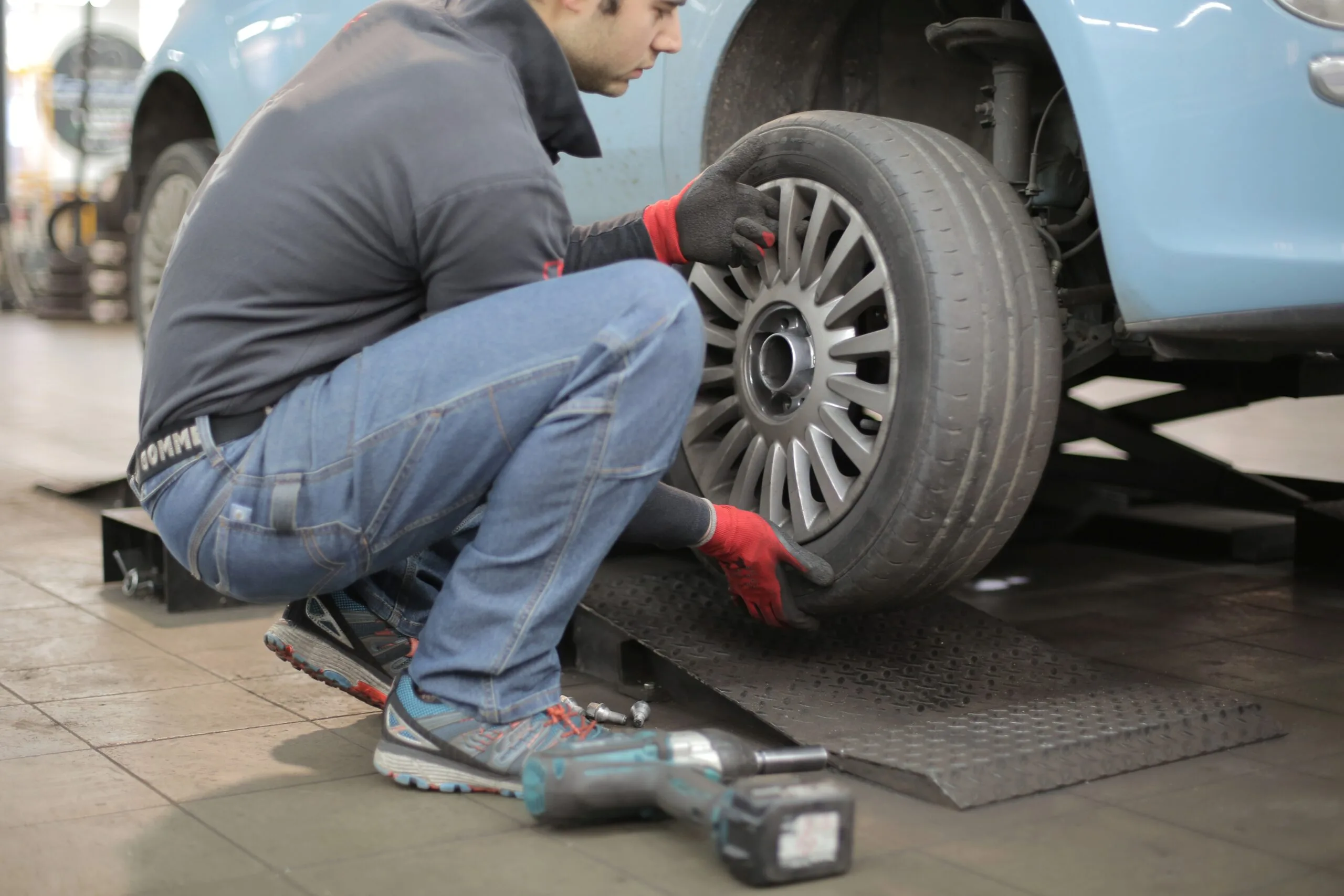
Con el Seguro para Automoviles te acompañamos a moverte de forma segura, por eso brindamos diferentes opciones para que elijas el plan que más se acomoda a tu estilo de vida y lo que debes tener en cuenta para tu seguro.

Con este seguro no tendrás que preocuparte ante cualquier situación, ya que tendrás la asesoría y coberturas indicadas para ti.


Viaja tranquilo y sin preocupaciones.

¿Qué te ofrecemos?

Algunas coberturas incluyen:

  • Responsabilidad Civil Extracontractual
  • Pérdida total de tu vehículo
  • Daños parciales
  • Asistencias para tu comodidad

¿Qué incluye un seguro para autos?

Acerca del SOAT

¿Qué pasa con los Daños Parciales?

¿Y si es Pérdida Total?

Asistencias a las que tendrás acceso

  • Cuando te quedas sin batería
  • Gastos médicos en el exterior
  • Cuando dejas las llaves dentro del carro
  • Si te quedas varado durante tu viaje
  • Cuando tu vehículo se queda varado

Asistencias a las que tendrás acceso

Cuando te quedas sin batería

Cuando dejas las llaves dentro del carro

Cuando tu vehículo se queda varado

Gastos médicos en el exterior

Si te quedas varado durante tu viaje

Empezemos con una cotización detallada

Con la información que nos brindas, podremos ayudarte a conseguir el seguro que más se ajuste a tus necesidades.

¡Nos comunicaremos contigo!

Una vez envíes el formulario, revisaremos tu información y agendaremos tu llamada (en nuestro horario laboral) o te enviaremos un correo o mensaje según lo prefieras!

También te puede interesar